

Location is a categorical value, so you can still use a standard bar or row chart to illustrate location values. The bar chart is good at showing ranking and value differences, but in the case of location it might not be as helpful for context or interest as a map.
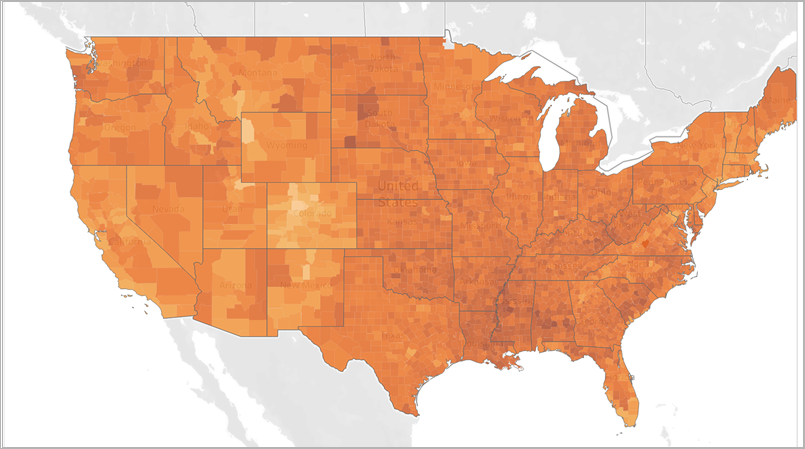
Choropleth maps are a good option for showing 1 dimension overlaying a map. A downside to this map (and anytime you use colour for a dimension) is that it can be hard to tell the difference between the values for 2 categories, especially if they are far apart on the map.
Remember the rules for colour when choosing the colour for your map!

Bubble maps are a way to add a 3rd dimension/ variable (1st is location, 2nd is coloured dimension) with the size of the bubble. The downside of this map is that the bubbles can become overlapped and clustered, making the data harder to understand.
