
Suggested graphs that include categorical variables / dimensions

Bar Chart:
Good for:
✔ categorical values
✔ easily showing differences
✔ sorting/ ordering / ranking
Bad for:
✘ continuous values
✘ parts of a whole

Pie Chart
Good for:
✔ 1 to 3 values!!!
✔ Percentages
✔ Parts of a whole
Bad for:
✘ more than 4 values (becomes cluttered)
✘ comparing many different categories
✘ non-complete (not parts of a whole)

100% Bar Chart
Good for:
✔ Many categorical values
✔ Percentages
✔ Parts of a whole
Bad for:
✘ non-complete (not parts of a whole)

Dumbbell Chart
Good for:
✔ categories with a minimum and maximum
✔ comparing 2 categories
✔ showing overlap
Bad for:
✘ comparing totals
✘ showing averages
✘ showing distribution

Parallel Coordinates Plot
Each parallel line is a variable that can have different units of measurement for different variables. The chords are an observation or category (make sure to label those too). The height and angles of the "chords: illustrate the relationship between variables.
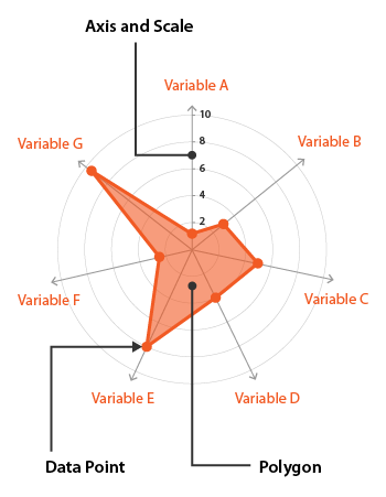
Radar Chart
Similar to a rounded version of the parallel chord chart, but:
These are also hard to read and understand in less you are familiar with them (and even still when you are)
Add another numerical dimension to a chart using colour or size!

For representing categories use a palette in which the colours have distinctly different names.

Change the shape of a point to represent a category (make sure to include in a legend!)
